
Stressless is a mobile wellness app designed to help young adults manage stress, understand their emotions, and access grounding practices — in minutes, not sessions.
The mental wellness market is crowded and growing. Most of it isn't working.
I took on Stressless as a project with a specific constraint: don't add to the noise.
Before defining a single feature, I needed to understand why an entire category of well-funded, well-designed products keeps failing its users at the same moments.That meant leading a full research cycle — setting the scope, choosing the methods, interpreting the findings, and making the product calls that followed.
The output was a focused, validated MVP direction grounded in what users actually need.
Stressless is a mobile wellness app designed to help young adults manage stress, understand their emotions, and access grounding practices — in minutes, not sessions.
The mental wellness market is crowded and growing. Most of it isn't working.
I took on Stressless as a project with a specific constraint: don't add to the noise.
Before defining a single feature, I needed to understand why an entire category of well-funded, well-designed products keeps failing its users at the same moments.That meant leading a full research cycle — setting the scope, choosing the methods, interpreting the findings, and making the product calls that followed.
The output wasn't a research report. It was a focused, validated MVP direction grounded in what users actually need.
Deliverables
Deliverables
UX Research
Product Strategy
Wireframes MVP
UX Research
Product Strategy
Wireframes MVP
Year
Year
2025—2026
2025—2026

The Strategic Bet
Mental health apps aren't failing because of bad content or poor visual design. They're failing because they're built around engagement mechanics that conflict with the emotional state of the people using them.
Someone opening a wellness app mid-anxiety doesn't want a content library. They want immediate, low-effort relief. The entire category keeps optimizing for retention and depth when the real unlock is speed to value.
That was the hypothesis I set out to pressure-test.
Defining the Right Research Questions
Before touching methods, I scoped the inquiry around three questions that would actually drive product decisions:
Where does trust break down — and why so early? What does "quick relief" mean behaviorally, not just in self-report? And what would make someone return the next day, without a push notification forcing them to?
Everything else was secondary. That focus kept the research from becoming a sprawling audit and kept synthesis actionable.
Competitive Landscape
I audited six direct and indirect competitors — Headspace, Calm, Meditopia, BetterMe, Open, and others — across both functional capability and UI patterns.
The findings weren't surprising. They were clarifying.
Every major player has converged on the same model: broad content libraries, long onboarding, shallow mood tracking, low personalization. 30–40% of users drop off during onboarding. Not after a week. During signup.
The category has a structural problem, not a design problem.

Eleven Interviews. One Core Tension.
I ran eleven in-depth interviews to go beyond behavioral patterns and get at the emotional logic underneath.
What I found wasn't a list of feature requests. It was a consistent tension: users come to these apps in moments of genuine need, and the apps respond by demanding effort. Long questionnaires. Too many choices. Practices that require focus users don't have when they're stressed.
The apps are designed for a calm, motivated user. The actual user is neither.
That reframe changed how I thought about the entire product.
The User Who Made It Real
Personas are only useful if they force hard product decisions. Maria did that.
30 years old. Customer support. High workload. Three minutes, not thirty. She knows what she needs — she just can't find a tool that respects her constraints.
Every time a feature felt tempting to add, Maria was the filter. Would this make her first session faster and clearer, or slower and harder? That question cut scope more effectively than any prioritization framework.
Where I Chose to Focus — and What I Left Out
The research surfaced more opportunities than an MVP could hold. The harder work is deciding what not to build.
I made three deliberate calls:
No content library at launch. A curated, single daily recommendation reduces decision fatigue and creates a stronger first-session experience than breadth ever could.
No deep personalization upfront. Users don't trust the app yet. Asking for detailed preferences before delivering value is the wrong order of operations. Earn trust first, then customize.
No social features. They test well in concept. They complicate the emotional safety of the experience. Not the right tradeoff for this audience at this stage.
Hypotheses That Drove the Prototype
Five testable bets shaped the MVP:
Streamlined onboarding — essentials only, optional depth for those who want it — would increase completion and get users to value faster. One personalized daily practice would outperform a content menu for both engagement and return rate. Visible progress through streaks and emotional trends would build the habit loop the research said users wanted but couldn't find. Contextual mood notes would create reflection depth without friction. Toggleable guidance would serve both independent and supported users without forcing a choice.
Each hypothesis was specific enough to test. Each connected back to a finding.

Testing, Iteration, and What Changed
Five usability sessions on the prototype. The goal wasn't validation — it was to find where my assumptions were wrong.
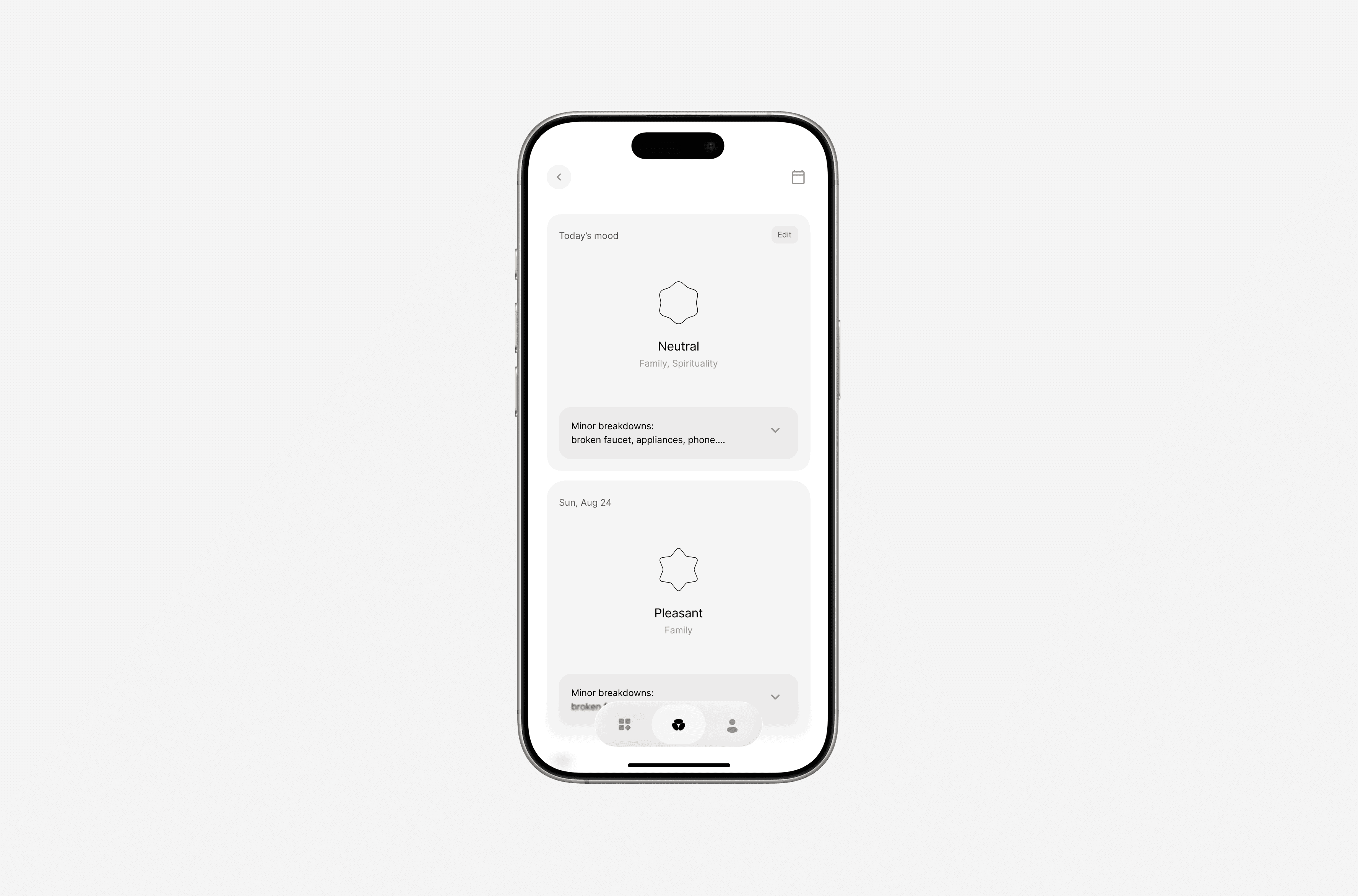
The quick-practice flow held up. The mood logging didn't — shortcuts were unclear and the interaction added friction at the worst moment. Some category labels were too abstract to be useful. Users wanted more expressive, visual emotion input than the first version offered.
I simplified the UI, restructured navigation, and updated the emotion selection model. The changes weren't cosmetic. They came directly from watching people use the product.
Five usability sessions on the prototype. The goal wasn't validation — it was to find where my assumptions were wrong.
The quick-practice flow held up. The mood logging didn't — shortcuts were unclear and the interaction added friction at the worst moment. Some category labels were too abstract to be useful. Users wanted more expressive, visual emotion input than the first version offered.
I simplified the UI, restructured navigation, and updated the emotion selection model. The changes weren't cosmetic. They came directly from watching people use the product.

Outcomes
The research produced a validated MVP scope — five hypotheses, a tested prototype, and a clear rationale for what was cut and why. Usability testing confirmed the core interaction model and surfaced two structural changes that meaningfully reduced friction before any development began.
The project also reframed the problem itself: from how do we design a better wellness app to how do we build one that works for someone who's already overwhelmed. That shift drove every product decision that followed.
All Rights Reserved
All Rights Reserved
All Rights Reserved